

Author: Bob May 11, 2023 16 min read
Today, we’re going to elaborate on a topic that’s sure to engage businesses that invest in trendy designs—the use of flat characters, hyperrealism, and old school approaches. These are all different animation styles that can be employed to create impactful stories. Anyway, all of these 2D techniques have their own strengths and weaknesses, so it’s vital to learn their full potential.
In this article, we’ll explore how you can take maximum advantage of these innovations in your explainer video or cartoon, and discover which approach might be best suited to your business style. So, grab a cup of coffee and join us as we delve into the fascinating world of animation techniques!
Cartoons have been around for over a century and have come a long way since their inception. From Mickey Mouse to SpongeBob SquarePants, they have captured our hearts and minds in so many ways.
Cartoons have a rich history that dates back to the early 1900s, when animated shorts were first introduced to the public. Since then, the art of animation ideas has evolved and expanded into numerous design styles and genres. From classic Disney movies to adult-oriented shows like South Park and Family Guy, cartoons have something for everyone.
In recent years, we’ve seen a surge in the popularity of Japanese anime and manga. These design styles have gained a massive following around the world, with their unique video storytelling and striking visuals.
But cartoons aren’t just for entertainment anymore. Animated videos have become a popular method of advertising lately. They appeal to viewers with their striking visual style and can be easily remembered. Many companies have already tried this approach for their advertising campaigns, which has helped them attract new customers and increase their profits.
One company that has used animated cartoons for their advertising is Chipotle. In 2013, they released “The Scarecrow,” which went viral and got a lot of attention for their brand. The commercial told the story of a scary scarecrow who decided to fight the fast food industry. This commercial brought attention to the problems of modern food and sparked a discussion about healthy eating.
As technology advances, so do the possibilities for the future of cartoons. With the advent of virtual reality and 3D animation, we may soon see a whole new world of immersive cartoon experiences. Next, we will take a look at a few trends for your video marketing that can take your business to the next level.
Now, let’s consider an interesting trend in animated storytelling—Flat Characters. You may have heard this term before, but don’t worry if you’re unfamiliar with it. Simply to say, flat design characters are those who lack depth and complexity, and are often used to serve a specific purpose in a story. While this may sound counterintuitive to good storytelling, there are some unique advantages to using flat design characters that we’ll explore in more detail. So, let’s dive in and learn more about this trend in animation for business promotion.
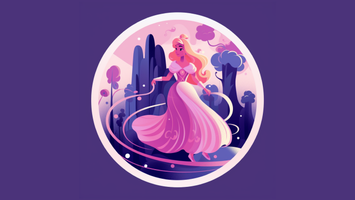
It’s a fascinating technique that’s gaining popularity in the world of art. Flat design illustration refers to a style where the emphasis is on bold and simple shapes, solid colors, and minimal detail. This technique is commonly used for creating characters and scenes for comics, children’s books, and even branding designs.
What’s spectacular about this approach is that it can be used to convey a story or message in a clear and concise way, making it easy for the viewer to understand and relate to. Flat design brings a unique charm and playfulness to a story, making it a great choice for anyone who wants to create something that’s both visually appealing and easy to follow.
On the pro side, flat design gives your animation a modern, clean and simple look that can be very appealing to viewers. It’s also a great way to make your content stand out, as it tends to be more eye-catching and memorable than more traditional, detailed illustrations.
Additionally, flat characters are often easier and faster to produce than more complex design styles, making it a good choice for projects with tight deadlines or limited resources.
However, there are also some potential downsides to using flat design, such as its limited ability to convey depth or realism. So, it comes down to weighing the benefits against the limitations and determining whether 2D illustration is the right choice for your particular project.
When it comes to market leaders in the animation industry one of the best examples could be the McDonald’s 2021 commercial, which used 2D animations, featured several characters. The main one was a girl who revived the city with her movements and enjoyment of life. The girl was drawn in bright colors, with big eyes and a smile on her face, which made her very attractive and cute.
Also, various items and food from McDonald’s menu, such as fries, hamburgers, and ice creams were used in the advertisement. These items were animated and drawn in bright colors, making them very appealing and desirable. The use of 2D animations in the McDonald’s commercial helped create vivid and memorable characters that made the commercial more emotional and appealing to viewers.
The use of vibrant colors is an exciting and powerful technique that can make your animations stand out and grab people’s attention. When you contrast the palette, you’re using two colors that are very different from each other, such as black and white, or blue and orange. This opposition creates a visual impact that is eye-catching and can evoke strong emotions in your audience.
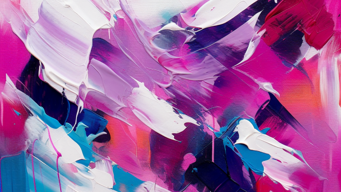
Let’s start with the advantages. One of the biggest benefits of using contrasting colors in your design or 2D illustration is that it can really make your work stand out. By pairing colors that are antithetical to each other, you create a bold and memorable effect that draws the viewer’s attention.
Contrasting colors also make a sense of depth and dimension in your work. By using complementary colors, you can make certain elements pop out while others recede into the background. This can give a sense of visual hierarchy, making each element easier to read and understand.
However, this animation idea also has some potential downsides. One of the most enduring challenges in using contrast colors is making sure that the palette you choose actually works well together. If you’re not careful, you can end up with colors that clash and create an unpleasant visual experience.
Another disadvantage is that using too much contrast can be overwhelming for the viewer. If you use a huge variety of bright and bold colors, it can be difficult for the spectator to focus on any element in your design.
When looking at the use of contrasting colors, a good example is Apple. Despite its minimalism and linearity, but in their commercials they use contrasting colors, such as bright yellow, red and green, to draw attention to their products. The commercials usually show beautiful shots using light and shadow effects.
This trend is all about using bright, vibrant neon colors and futuristic, cyberpunk-inspired visuals in your animation. It’s a great way to create a stunning and immersive experience for your audience.
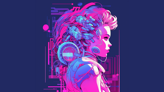
On the one hand, using neon and cyberpunk animation can create a unique and memorable visual experience for your audience. The vibrant neon colors and high-tech aesthetics of cyberpunk can help your animation character stand out from the crowd and make a lasting impression.
Another advantage is that these design styles allow you to explore themes related to technology, society, and the future in a visually striking way. They also provide a great backdrop for action and adventure stories.
On the other hand, there are also some disadvantages to using neon and cyberpunk in animation idea. One of the main drawbacks is that these styles can quickly become overused or clichéd, especially in a market saturated with similar visual design styles. This will make your animation character feel less original and engaging.
Another disadvantage is that neon and cyberpunk are challenging to pull off effectively, especially if you’re not experienced with these styles. Getting the colors, lighting, and overall atmosphere just right can be difficult and time-consuming.
Neon and cyberpunk take a significant part in animation innovations these days, and there are several companies that are using them to create amazing visuals and stories. Neon and working with its light is a very complex process, but when done right, it can be a truly unforgettable experience for your client. A wonderful example could be KabelDirect DisplayPort
that included neon lighting to create movement and dynamics around the TV. Don’t forget to read our case study to discover the smallest details about this project!
This is a really breathtaking development that’s been gaining popularity recently. It’s been fascinating to see how artists and animators are using this technique to create some truly engaging artworks.
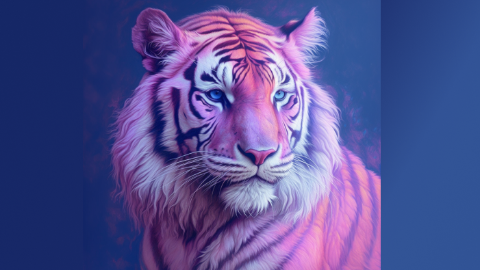
So, what is a hyperrealistic cartoon? Basically, it’s a style of animation that creates images that are lifelike, they almost look like photographs or video footage. This means that animators are using incredibly detailed textures, lighting, and camera angles to produce a sense of realism that’s never been seen before in animation.
One of the really cool things about hyperrealism is that it’s being used in all sorts of different animation styles. From feature films and video games to TV shows, animators are finding new ways to push the boundaries of what’s possible with hyperrealistic visuals.
Hyperrealism also helps to create a stronger emotional connection between the viewer and the personages. When we see animated characters that look and act like real people, it’s easier for us to relate to them and become immersed in their story.
Of course, there are also some challenges associated with hyperrealistic cartoon characters. Creating images that are this detailed and lifelike requires a lot of time, skill, and resources, which means that it’s not always feasible. Additionally, there are concerns about the “uncanny valley” effect, where images that are too realistic can actually be off-putting or unsettling for viewers.
However, despite these challenges, it’s clear that hyperrealism is a trend that’s here to stay in the animation industry. And as artists continue to explore new ways of using this technique, we can’t wait to see what amazing things they come up with next!
The biggest advantage of hyperrealism is the level of detail that can be achieved. When an artist or designer is able to create something that looks almost like a photograph for your business promotion, it can be incredibly impressive and awe-inspiring. This level of detail also makes the visuals feel more immersive, as if your potential customer is actually part of the scene.
If you’re trying to convey a message or an idea, using hyper realistic visuals can help to make that message more clear and memorable. This is especially true in fields like medicine or engineering, where precise details are critically important.
There are also some disadvantages to consider. For one thing, the production of such visuals is incredibly time-consuming and expensive. Creating a hyper realistic image or design often requires a lot of skill, patience, and attention to detail, which makes it a difficult process.
Another downside of hyperrealism is that it sometimes feels sterile or lifeless. As hyperrealistic visuals are so precise and exact, they sometimes lack the emotional impact that more abstract or impressionistic visuals have. This isn’t always the case, of course, but it’s something to consider.
Among the businesses that have successfully integrated hyperrealistic design in their advertising is Coca-Cola. In 2014, the company launched a campaign called “Share a Coke,” which featured hyperrealistic illustrations of people’s names on Coca-Cola bottles and cans. This campaign was a huge success, with society all over the world sharing photos of themselves holding their personalized Coca-Cola products on social media.
Another business that has embraced hyper realistic design is IKEA. The furniture company has used such 3D renderings to showcase their products in a virtual setting, allowing customers to visualize how the furniture will look in their apartments. This has helped to increase customer engagement and sales, as people are more likely to make a purchase when they can see how the product will look in their own space.
There’s something truly magical about the traditional way of creating 2D animations. The amount of skill and patience required to make every frame of a hand-drawn animation is truly awe-inspiring. From the days of Steamboat Willie to Snow White and the Seven Dwarfs, these videos have a unique charm and character animation that simply can’t be replicated with modern computer-generated techniques.
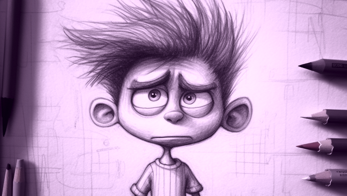
Old-school techniques are the level of detail and nuance to be mindful of and aware of. Animators could spend hours creating each individual frame, carefully crafting the movements and expressions of their characters. The result is a rich and complex animation that’s full of life and personality.
Another benefit of traditional cartoon animation is the sense of artistry that’s inherent in the process. Animators are true artists, using their talents and creativity to bring their characters and stories to life. Each frame is a work of creation in and of itself, with its own unique style and personality.
Otherwise, old-school techniques also have limitations in terms of special and visual effects. While 2D animation trends include stop-motion techniques that can create impressive results, it is often limited to the capabilities of the materials used, and hand-drawn cartoons can be restricted in terms of color and detail. The cost of producing traditional animation can be high, requiring skilled labor and expensive materials. This can make it challenging for independent animators or smaller studios to compete with larger production companies.
When it comes to 2D animation trends, there’s nothing quite like combining new animation innovations with old-school techniques. It’s a truly exciting way to create something new while still paying homage to the techniques that paved the way for modern animation. With the rise of computer-generated imagery (CGI) and digital animation trends, it’s easy to forget about the traditional techniques like hand-drawn animation and stop-motion. But the truth is, these different methods are still just as relevant and effective as ever.
By blending old-school techniques with animation innovations like 3D modeling and motion capture, you can create truly unique and visually stunning works of art. The result is a style that’s timeless and cutting-edge at the same time.
The Wow-How team is so excited to share with you some tips on how to successfully experiment with old-school techniques and animation innovations.
To successfully combine them, start by identifying the key elements that you want to incorporate into 2D animations for achieving your business goals. For example, if you aim to achieve a hand-drawn aesthetic, consider using traditional animation techniques for the key frames. Also, use modern tools to help streamline the process, such as implementing a digital tablet for drawing.
Another tip is to experiment with different combinations of techniques to find what works best for your brand style. For example, the designers might use CGI to create complex background elements and then layer hand-drawn characters on top to make a unique visual style. It’s also important to consider the practical aspects of combining techniques, such as ensuring that the different animation style elements can be seamlessly integrated and that the workflow is efficient.
Finally, don’t be afraid of taking risks and pushing the boundaries of what’s been done before. Experimenting with different trend techniques can lead to unexpected and exciting results that can set your business animation apart from the rest, so you will definitely win the customers’ hearts!
Just a masterpiece example for the mix of some might be the video for ByoWave produced by Wow-How experts. In this video, neon, 3D graphics, as well as hyperrealistic design are excellently combined to communicate the company’s style and values in the best possible way. This work proves that mixing styles can be obtained in an unforgettable and exciting project, which is sure not to leave viewers indifferent.
Whether you prefer the simplicity of flat characters or the detail of hyperrealism, there are ways to use these techniques to create truly compelling and memorable heroes that will match your brand’s identity and motivate potential customers to act.
By understanding the strengths and limitations of different approaches, and by staying up-to-date with the latest tools and trends, you can push the boundaries of what’s possible in character animation design to boost your business promotion. And by combining these innovations with timeless principles of storytelling and design, you can create characters that resonate with audiences and stand the test of time.
Contact us to create the most suitable video that will both address your clients’ pain points and match your brand style. Communicate your value in the most appealing way!